When a company changes its logo, it is something you typically notice, but don’t necessarily give it much thought.
But maybe I think about it more than I realize, and maybe others do too.
In 2017, Tyson Foods departed from using the oval-shaped logo that was red, outlined by an orangish-yellow and the word Tyson in white for its companywide logo, even though that was still the logo you saw on its chicken products. Its companywide logo was a dark blue, that had a T in a circle with a weather vane arrow going through it.
It made sense for some sort of way to differentiate the more diversified company as a whole from its chicken division, even though chicken is the sector where the company originated.
Again, I didn’t give it a lot of thought, but since that time, whenever I select a photo of Tyson as a company beyond its chicken division, I try to make sure the 2017 logo there, rather than the older one.
Then, within the past week or so, I got an email about a securities filing from Tyson Foods. I opened it and noticed what appeared to be the pre-2017 logo in place, as well as whatever piece of information included in the filing, which I apparently didn’t consider important enough to report about. I did, however, think it was odd that they were using what I thought was an old logo.
Worth Sparkman sets me straight
Not long after I noticed the company’s choice of the logo on the securities filing, I came across an Axios story, written by reporter Worth Sparkman, concerning the Tyson Foods logo.
Sparkman is a former Tyson Foods public relations manager with whom I became acquainted when he worked in that capacity. I always appreciated the good work Sparkman did for Tyson, and it turns out that Sparkman is still keeping me informed about Tyson business in his current job.
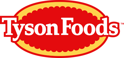
Sparkman reported that what I saw on that securities filing isn’t the same as the earlier logo still seen on chicken products. This one is in fact new – sort of. Now instead of just the word “Tyson” in the logo, it now says “Tyson Foods.” Subtle change, but enough of a change you can call it new.
What the company said
Apparently, when Sparkman reached out to his former employer, they didn’t have much to say at the time, other than saying “not too much to say on that,” and “we are not sharing anything externally until likely next week.”
A day or two later, I saw that Talk Business & Politics (TBT) also reported on the logo. And in this report, it did include a statement attributed to Tyson Foods CEO Donnie King.
I reached out to a person holding a position with Tyson similar to the one Sparkman once held, and did get the statement, which read: “Last week, Tyson Foods unveiled our new corporate brand to our 139,000 team members around the world. Our new visual identity unifies our history and our future. Almost ninety years ago, Tyson Foods began as a chicken company and today we have evolved into a world-class food company and recognized leader in protein. We have the distinct privilege of bringing people together over food, and our iconic brands like Tyson, Jimmy Dean, Hillshire Farm, Ball Park and more, stand should-to-shoulder with some of the best-known brands in the world. We will use our new corporate brand to help us communicate our purpose: Tyson Foods. We feed the world like family. Family anchors us in our legacy as a company dedicated to bringing high-quality food to every table in the world, safely, sustainably, and affordably, now and for future generations.”
Is this change good?
I, for one, see perfect sense in the rationale behind the change, in that it unifies the company’s past and its future. The inclusion of the word “Foods” into an otherwise pre-existing logo shows the company is proud of its heritage, but wants to embrace the fact that it is more than just a chicken company.
That was somewhat the rationale behind the old logo, which was adopted during Tom Hayes’ tenure as CEO. (Two other CEOs came and went between Hayes’ and King’s stints.)
Hayes and his crew meant well with the new logo, and it was explained at the time that,” the weather vane is the farmer’s compass; it signals direction. At Tyson Foods, our compass points forward.”
But it was possibly too far removed from the Tyson logo consumers were familiar with for so long.
Sparkman even quoted TBP’s Michael Tilley as saying of the 2017 logo: “This thing looks like a bad prison tattoo.”
That made me laugh, even if it was a little harsh. But it did make me stop and think, that the logo of that era did look a little gooney.
 Tyson Foods' newest facility in Bowling Green, Kentucky, features the now-outdated corporate logo.Courtesy Tyson Foods
No doubt adoption of this new logo will come at a great cost to the company, especially when I think about how its newest facilities were built with the pre-existing logo in all signage.
But those costs could be short-term and turn into profits. After all, marketing is essential for the survival of an agrifood business, and very central to any marketing is an effective logo.