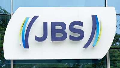
As it observed 70 years in business, JBS rolled out a trademark that reflects a journey of growth and evolution of the company that was founded in 1953 as a small butcher’s store in Goiás, Brazil, and is today one of the largest global food companies.
JBS now produces all types of proteins and is present in the homes of millions of people across every continent. Today, the company’s visual identity not only represents this trajectory, but also conveys its vision of the future.
“We started out as a little beef store in the hinterland of Brazil, and we have become one of the world’s major food companies. We are a multi-protein, multi-geographic company that employs 270,000 people in over 20 countries. We have evolved a lot, above all in the last decade, so naturally our brand has also evolved,” said Gilberto Tomazoni, global CEO of JBS.
Effective October 16, those who visit the company’s head office in São Paulo city could see the changes in all visual applications developed over three years in partnership with FutureBrand. Gradually, the various units of JBS in Brazil and around the world, as well as the group’s various product lines in a wide variety of countries, will apply the new concept.
The traditional three letters of the company’s name are still present, but the lettering has been modernized along with the symbol that accompanies them. The ellipses serve as inspiration for the brackets that represent the hands, the protection and the consideration that bind the company, clients and consumers.
The mission of the new design is also to symbolize the company’s vision of the future that is being built on sound investment in innovation and the unbroken search for excellence. To symbolize this, there is an application in the brackets that represents constant and continuous movement. This movement seeks to express the different segments where JBS is present, the different people it serves and the many countries where it is located.
The visual identity carries the letters J, B and S and the brackets begin in a solid blue hue that represents the company’s strength to its partners, employees and other stakeholders. Throughout the movement of the brackets, various other shades of blue have been added that symbolize the different proteins and geographies where JBS operates. The green, in turn, represents the company’s commitment to environmental, social, operational and economic sustainability.
“We decided that the colors would represent our commitment to our culture and values, our social and environmental responsibility and the eternal search for excellence in everything we do,” said Tomazoni.


